
Interior house painting: how to choose the right colors for every room in your home
We partnered with a home improvement company for this post. The opinions in the post are honest. All reviews and opinions expressed in this post are based on our personal views. We are excited because we know you will love it.
Interior house painting is one of the easiest ways to change the mood, comfort, and style of a home without a full renovation.
I learned that firsthand after helping repaint a family home where one wrong shade made a bright room feel dull by late afternoon.
That experience made it clear that choosing paint is never just about liking a color chip.
It is about how that color works with light, furniture, flooring, and daily life.
Why the right paint color changes everything
A wall color does more than sit in the background.
It shapes how a room feels the second you walk in.
A soft neutral can make a space feel calm and open.
A deep tone can add warmth, depth, and character.
I remember visiting a friend after she repainted her dining room in a muted, earthy green.
Before that, the room felt plain and forgettable.
Afterward, it felt grounded, elegant, and much more welcoming during dinner parties.
Nothing else in the room had changed.
That is how powerful the right shade can be.
Many homeowners choose colors too quickly.
They see something online, fall in love with it, and expect the same result at home.
Real rooms do not behave like staged photos.
Natural light, lamp light, ceiling height, and trim color all affect the final result.
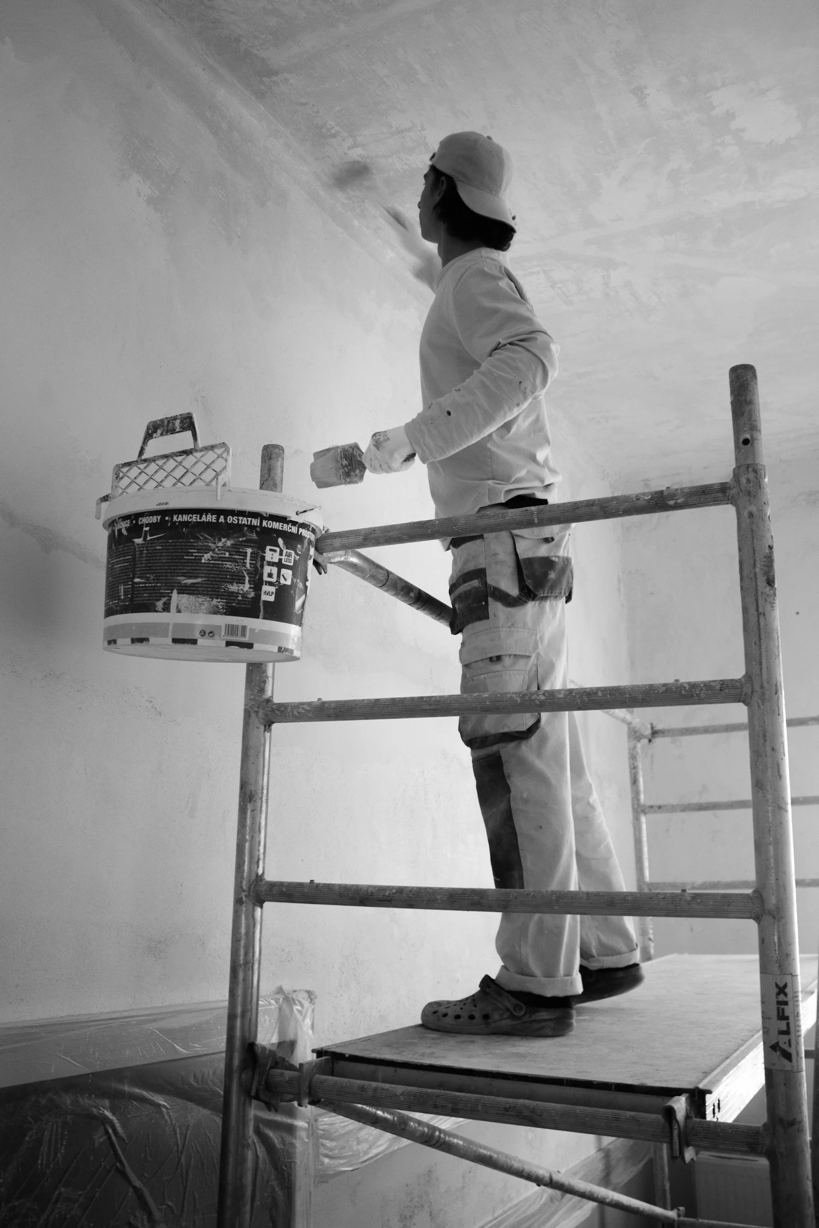
It is essential if you want consistent results, especially when planning a professional interior house painting project.
Start with the light in each room
Before picking a single sample, study the lighting.
This step saves time, money, and frustration.
A room with strong morning light will show color differently from a room that gets only soft evening light.
North-facing rooms usually feel cooler and can make gray, blue, or white shades look sharper.
South-facing rooms often pull out warmth and make soft neutrals glow.
East-facing spaces feel bright early in the day, while west-facing rooms warm up later in the afternoon.
I once tested a clean white in a hallway that looked beautiful at noon.
By evening, it turned flat and slightly cold under overhead lighting.
We changed it to a warmer white, and the hallway immediately felt softer and more inviting.
Always test swatches on multiple walls.
Look at them in the morning, afternoon, and night.
That simple habit can prevent a costly repaint.
How to choose living room colors that feel natural
Living rooms usually do the most work in a home.
They host guests, family movie nights, quiet mornings, and sometimes even work calls.
The color needs to be flexible enough to handle all of that.
Warm whites, greige, soft taupe, muted olive, and gentle gray-blue tones are strong options.
These shades create a welcoming base without overpowering the furniture or decor.
They also allow pillows, rugs, art, and wood finishes to stand out.
A few years ago, I helped repaint a living room that had a yellow-beige wall color that made everything look dated.
We switched to a light greige with warm undertones.
The sofa looked newer.
The natural light looked cleaner.
The room finally felt relaxed instead of tired.
If you want more personality, use color through one feature wall, built-ins, or trim detail.
That gives the room visual interest without making the whole space feel too busy.
Bedroom colors should support rest
Bedrooms need a different approach.
This is where strong light reflection and overstimulating tones can become a problem.
A bedroom should feel calm when the day starts and even calmer when it ends.
Soft blue, dusty rose, warm sand, muted lavender, and creamy off-white tones work well in many bedrooms.
These colors create a softer visual atmosphere and help the room feel settled.
I once painted a guest bedroom in a pale gray that looked elegant on the sample card.
After the full coat went up, the room felt lifeless.
The fix was simple.
We added a warmer undertone with a light taupe-gray, and the room became far more comfortable.
Dark colors can also work in bedrooms.
A charcoal, moody green, or rich navy can feel surprisingly cozy when balanced with lighter bedding and natural textures.
The key is making sure the room still feels restful rather than closed in.
Kitchens need colors that stay fresh all day
Kitchens are different because they are active, practical spaces.
The right wall color should feel clean, bright, and easy to live with.
It also needs to work with cabinets, counters, backsplash tile, and flooring.
White and off-white remain popular for a reason.
They reflect light well and make kitchens feel crisp.
But the wrong white can feel harsh or sterile.
That is why warm whites, creamy neutrals, and soft mushroom tones often feel more lived-in.
I saw this happen in a small kitchen with bright white walls and cool LED lighting.
The room felt almost clinical.
Once the walls were repainted in a softer warm white, the cabinets looked richer and the whole kitchen felt more inviting.
Soft sage and muted blue-gray tones can also work well in kitchens, especially when paired with wood accents or brushed metal finishes.
These shades add personality without making the room feel heavy.
Bathrooms benefit from simple, clean palettes
Bathrooms tend to be smaller, so color has a stronger visual effect.
A heavy shade can make the room feel boxed in.
A thoughtful shade can make it feel fresh and open.
Light gray, pale blue, soft green, and warm white are reliable choices.
These tones reflect available light and create a cleaner, airier look.
They also pair well with tile, mirrors, chrome fixtures, and natural stone.
I once helped redo a powder room with a dramatic dark color because the homeowner wanted something bold.
It looked stylish in photos, but in real life the room felt cramped.
After switching to a lighter color with subtle warmth, the room felt twice as comfortable.
If you want drama in a bathroom, try using it in the vanity color, mirror frame, or accessories instead of the entire wall surface.
Undertones make or break the final result
This is the part many people skip.
Undertones are the hidden hints of color beneath the main shade.
A beige may lean pink, yellow, or gray.
A white may lean blue, cream, or green.
That matters more than most people realize.
Two grays can look almost identical in a store and then look completely different once painted.
One may feel warm and balanced.
The other may turn icy next to wood flooring.
I always compare paint samples beside trim, flooring, furniture, and countertops.
That side-by-side view tells the truth quickly.
It also helps avoid the common mistake of picking a color that clashes with fixed surfaces already in the room.
Keep your whole home connected
Every room does not need to match, but the home should still feel cohesive.
The easiest way to do that is by choosing a palette that shares similar undertones.
That gives each room its own identity while still making the full house feel connected.
A hallway, staircase, or open-plan layout especially benefits from this approach.
When one room suddenly shifts into a color that feels unrelated, the house can feel visually disjointed.
I saw that in a home where every room had been painted from a different trend cycle.
One room was blue-gray.
The next was tan.
The next had a pink-beige tone.
Individually, each one was acceptable.
Together, they made the home feel patchy and unfinished.
Once the palette was adjusted to warmer, softer tones throughout the house, everything flowed naturally.
Common mistakes that lead to repainting
The biggest mistake is choosing too fast.
Paint feels simple until it is on four walls and the room suddenly feels wrong.
Another mistake is relying only on tiny sample cards.
A color needs to be tested at scale.
What looks subtle in a small square may dominate a full wall.
Skipping surface prep is another issue.
If the wall has cracks, patch marks, grease, or uneven texture, even great paint will not look its best.
Clean surfaces and proper priming make a visible difference.
Finish selection matters too.
Flat and matte finishes soften walls and hide imperfections.
Eggshell and satin are easier to wipe down.
The right finish depends on the room and how much wear the walls will get.
Final thoughts on choosing paint with confidence
Choosing paint should feel thoughtful, not stressful.
When you pay attention to lighting, undertones, finish, and flow, the process becomes much easier.
You stop guessing and start making decisions that fit the way your home actually works.
The best rooms are not always the trendiest ones.
They are the ones that feel right when you walk into them.
They feel balanced in daylight.
They feel comfortable at night.
They support the purpose of the room instead of fighting it.
A good paint color does not beg for attention.
It quietly improves the space every single day.
That is what makes the right choice worth the extra time.